您现在的位置是:网站首页> 编程资料编程资料
html+css实现血轮眼轮回眼特效代码html+css实现图片扫描仪特效 html+css实现充电水滴融合特效代码
 2023-10-08
262人已围观
2023-10-08
262人已围观
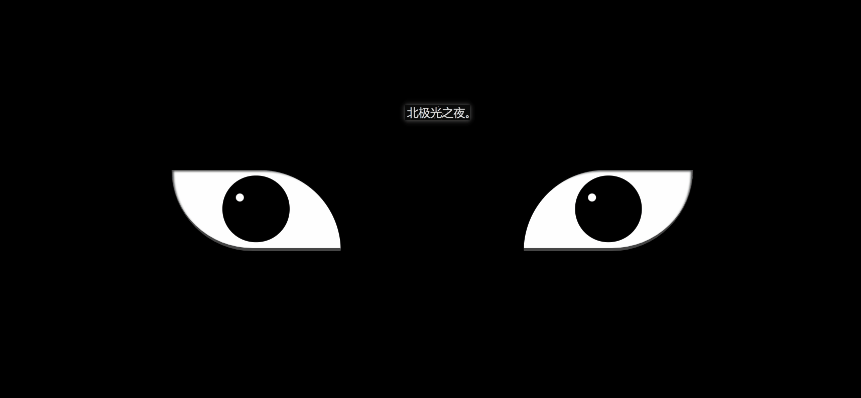
简介 这篇文章主要介绍了html+css实现血轮眼轮回眼特效 ,本文通过实例代码给大家介绍的非常详细,对大家的学习或工作具有一定的参考借鉴价值,需要的朋友可以参考下
效果(完整代码在底部):
实现并不难,都是重复的代码比较多。
实现(可跟着一步一步写):
1. 先定义基本标签:
2. 定义左右眼的基本css样式:
.zuo , .you{ width: 250px; height: 120px; background-color: rgb(255, 255, 255); border-bottom: 5px solid rgb(70, 70, 70); overflow: hidden; position: relative; }border-bottom: 5px solid rgb(70, 70, 70); 给个灰色的眼底。
overflow:溢出隐藏。
position: relative; 相对定位。
3. 开始先定义血轮眼的基本样式:
.zuo{ transform: translateX(-135px); border-radius: 0 120px 0 120px; box-shadow: inset 3px 2px 3px rgba(17, 17, 17, 0.8); }transform: translateX(-135px); 向左偏移,让两眼分开。
border-radius:给两个角设置弧度,形成眼睛形状。
bos-shadowL给眼角一点阴影。
4. 设置眼球宽高等:
.zuo::after{ content: ''; position: absolute; top: 50%; left: 50%; transform: translate(-50%,-50%); width: 95px; height: 95px; border-radius: 50%; border: 2px solid #000; animation: colour 2s linear forwards; } @keyframes colour{ 0%,30%{ background-color: rgb(0, 0, 0); } 100%{ background-color: rgb(255, 4, 4); } }position: absolute; 绝对定位
top: 50%;
left: 50%;
transform: translate(-50%,-50%); 居中对齐。
animation:设置动画,让其变红色。forward:继承最后一帧的属性。
background-color: rgb(0, 0, 0); 黑色
background-color: rgb(255, 4, 4); 红色。
5. 设置眼球正中间的黑点,都是些定位大小啥的,然后设置动画然它慢慢变大:
.zuoZong{ position: absolute; top: 50%; left: 50%; transform: translate(-50%,-50%); width: 0px; height: 0px; border-radius: 50%; background-color: rgb(0, 0, 0); z-index: 1; animation: da 3s linear forwards; } @keyframes da{ 100%{ width: 15px; height: 15px; } }6. 设置三勾玉所在的圈,设置动画让其显示与旋转:
.zuoYu{ position: absolute; top: -25px; left: -25px; bottom: -25px; right: -25px; border-radius: 50%; border: 2px solid rgb(0, 0, 0); animation: zhuan 2s linear 2s forwards; opacity: 0; } @keyframes zhuan{ 100%{ opacity: 1; transform: rotate(720deg); } }position: absolute;
top: -25px;
left: -25px;
bottom: -25px;
right: -25px; 大小。
border-radius: 50%;圆形。
border: 2px solid rgb(0, 0, 0); 黑色边框。
opacity:0;透明度为0;
transform: rotate(720deg); 旋转720度。
7. 制作三勾玉,先做一个圆,再用双伪类制作一个圆弧,两者结合就是勾玉了:
.zuoYu .yu{ position: absolute; width: 15px; height: 15px; border-radius: 50%; background-color: rgb(0, 0, 0); } .zuoYu .yu::after{ content: ''; position: absolute; top: -6px; left: -1px; width: 6px; height: 20px; border-radius: 50%; border-left: 6px solid rgb(0, 0, 0); }border-radius: 50%;
border-left: 6px solid rgb(0, 0, 0);
先让伪类为圆,再只设置一条边框,圆弧形成,再定位在父元素上,形成勾玉。
8. 给勾玉设置动画,让其从最中间变大旋转到勾玉所在的圈:
.zuoYu .yu:nth-child(1){ animation: yu1 2s ease-in 2s forwards; } @keyframes yu1{ 0%{ opacity: 0; left: 50%; top: 50%; transform:translate(-50%,-50%) scale(0.1) ; } 100%{ left: 50%; top: -9%; transform: scale(1) rotate(80deg); } }left: 50%;
top: 50%; 在最中间。
opacity:透明。
scale(0.1);缩小。
100%{…}到对应位置,同时变不透明和放大成正常大小。
9. 一样的,给其它两个勾玉动画:
.zuoYu .yu:nth-child(2){ animation: yu2 2s ease-in 2s forwards; } @keyframes yu2{ 0%{ opacity: 0; left: 50%; top: 50%; transform: translate(-50%,-50%) scale(0.1) ; } 100%{ top: 60%; left: -9%; transform: scale(1) rotate(-60deg); } } .zuoYu .yu:nth-child(3){ animation: yu3 2s ease-in 2s forwards; } @keyframes yu3{ 0%{ opacity: 0; right: 50%; top: 50%; transform: translate(-50%,-50%) scale(0.1); } 100%{ top: 60%; right: -9%; transform: scale(1) rotate(180deg); } }10.给两个眼睛都设置一个白点,相当于反光效果吧,至此血轮眼做完了:
.zuo::before,.you::before{ content: ''; position: absolute; left: 38%; top: 30%; width: 12px; height: 12px; border-radius: 50%; background-color: rgb(255, 255, 255); z-index: 10; }position: absolute;
left: 38%;
top: 30%; 定位相应的位置。
background-color: rgb(255, 255, 255); 白色。
z-index: 10; 设置为10,显示在最上层。
11.设置轮回眼基本css样式,跟血轮眼一样:
.you{ transform: translateX(135px); border-radius: 120px 0 120px 0; box-shadow: inset -3px 2px 3px rgba(17, 17, 17, 0.8); }12.设置眼球宽高等:
.you::after{ content: ''; position: absolute; top: 50%; left: 50%; transform: translate(-50%,-50%); width: 95px; height: 95px; border-radius: 50%; border: 2px solid #000; animation: youcolor 2s linear forwards; } @keyframes youcolor{ 0%,30%{ background-color: rgb(0, 0, 0); } 100%{ background-color: rgb(144, 130, 183); } }position: absolute; 绝对定位
top: 50%;
left: 50%;
transform: translate(-50%,-50%); 居中对齐。
animation:设置动画,让其变紫色。forward:继承最后一帧的属性。
background-color: rgb(0, 0, 0); 黑色
background-color: rgb(144, 130, 183); 紫色。
13. 设置眼球最中间的黑点,跟血轮眼也差不多:
.dian{ position: absolute; top: 50%; left: 50%; background-color: #000; transform: translate(-50%,-50%); border-radius: 50%; z-index: 10; animation: youda 3s linear forwards; } @keyframes youda{ 0%{ height: 0px; width: 0px; } 100%{ height: 15px; width: 15px; } }14. 设置轮回眼每个圈,同时设置动画让其变大:
.youYu{ position: absolute; top: 50%; left: 50%; transform: translate(-50%,-50%); } .quan{ position: absolute; border-radius: 50%; border: 2px solid #000; z-index: calc(1 - var(--r)); animation: zhi 2s ease-out 2s forwards; } @keyframes zhi{ 0%{ top: calc(var(--r) * 1px); left: calc(var(--r) * 1px); right: calc(var(--r) * 1px); bottom: calc(var(--r) * 1px); } 100%{ top: calc(var(--r) * -35px); left: calc(var(--r) * -35px); right: calc(var(--r) * -35px); bottom: calc(var(--r) * -35px); background-color: rgb(187, 177, 214); } }z-index: calc(1 - var(–r)); 计算,让最开始的圈显示在最上层。
animation:设置动画,让轮回圈慢慢变大,同时变成紫色。
完整代码:
Document